Deprecated: Function WP_Dependencies->add_data() was called with an argument that is deprecated since version 6.9.0! IE conditional comments are ignored by all supported browsers. in /home/vadnaise/public_html/wp-includes/functions.php on line 6131
Deprecated: Function WP_Dependencies->add_data() was called with an argument that is deprecated since version 6.9.0! IE conditional comments are ignored by all supported browsers. in /home/vadnaise/public_html/wp-includes/functions.php on line 6131
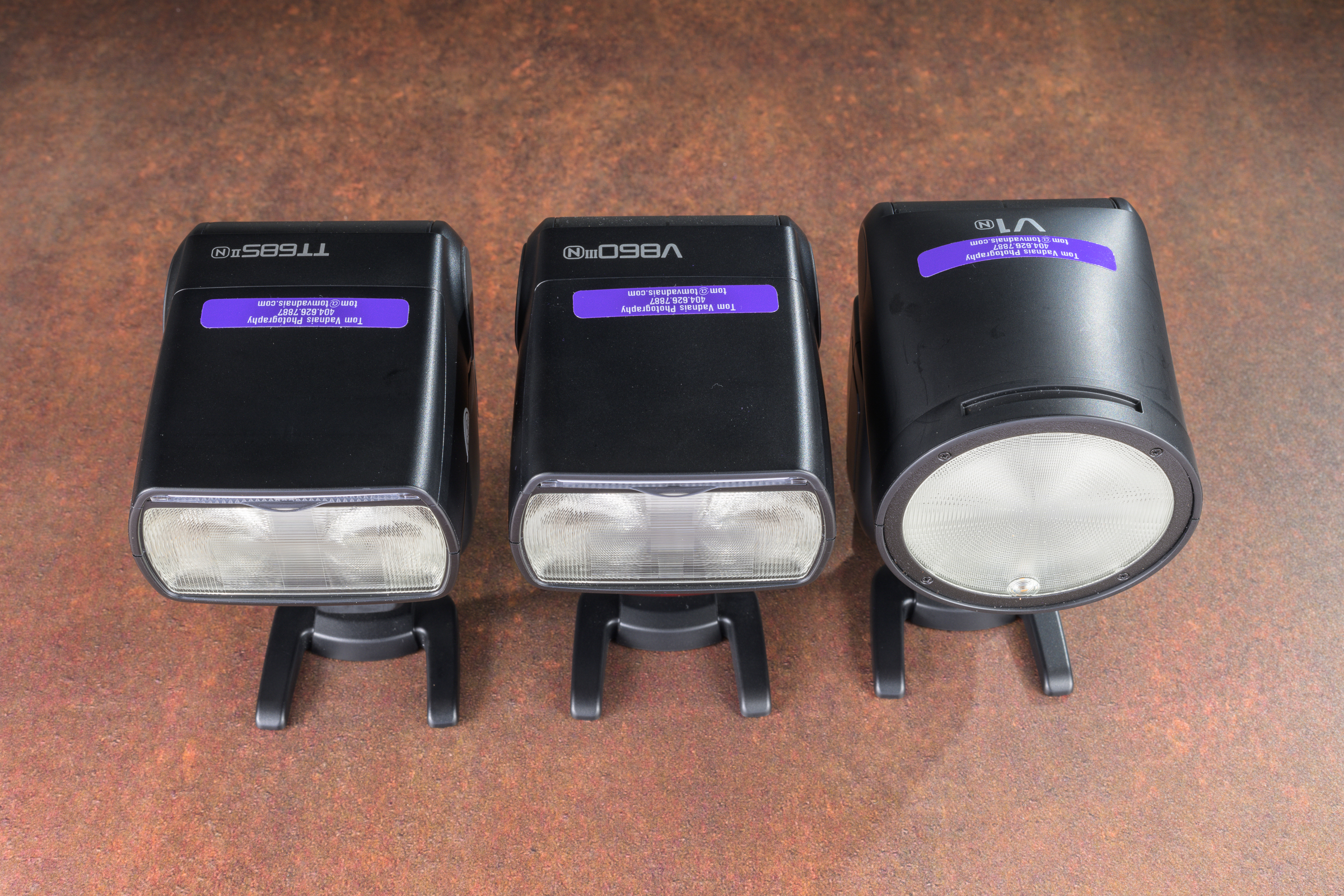
Godox makes three models of speedlites that are similar, but each have their own unique features. This is a long post, but it should help you decide which model to buy.
Common to all models
-1- All three models can be used by themselves in the camera’s hot shoe, or in combination as either master or remote flashes in a multi-flash setup. They are all fully compatible with the Godox X3 and X3 Pro wireless radio triggers, too.
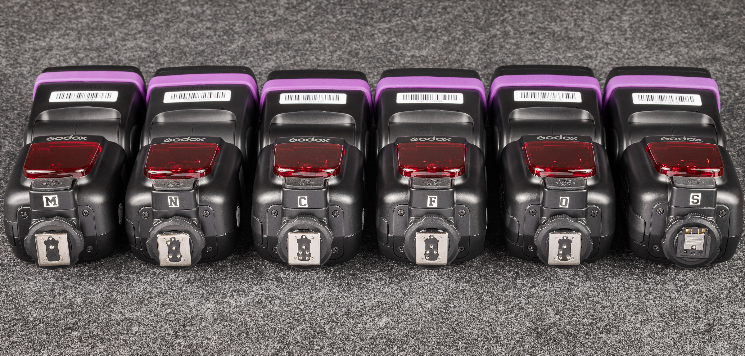
-2- Godox makes versions of each model for Nikon (N), Canon (C), Sony (S), FUJIFILM (F), and Olympus/Panasonic (O). (The M flash at the left below is the TT600 pure manual flash.) These camera-specific versions allow the same full TTL compatibility as do the camera manufacturer’s flashes. They are denoted by the first letter of the camera brand as a suffix. In other words, for a Nikon camera, you would order a TT685iiN or V860iiiN or V1N. [Click on image to enlarge, then click on left arrow to return to post.]
Godox TT685 flash hot shoes for different camera brands.
-3- All of these Godox flashes can be used in full manual mode on any camera body by any manufacturer—except for Sony. Because of its different hot shoe design, including the position of the firing pin, flashes for Sony do not work in other camera hot shoes—even in manual mode. Likewise, flashes with hot shoes for other camera brands will not work in a Sony hot shoe, even in manual mode.
-4- That being said, Godox flashes for any camera brand will work in TTL mode as remote flashes as long as the master flash or wireless trigger in the camera hot shoe matches the camera brand.
For example, on a Nikon camera, you could use a Godox TT685iiN in i-TTL mode (which is Nikon’s brand of TTL) in the camera’s hot shoe. You could then use a second TT685ii in i-TTL, regardless of the camera body brand the flash was made for. For instance, a TT685iiC (designed for e-TTL in Canon cameras) would work in Nikon’s i-TTL when used as a remote as long as a TT685iiN, V850iiiN, V1N, or wireless trigger for Nikon was in the hot shoe as the master or controller flash or trigger. That’s pretty remarkable. I highly recommend you buy all your flashes for your camera body brand, but you might be able to borrow Godox flashes for other camera brands from colleagues for additional off-camera flash setups.
-5- In Manual mode, flash power can be adjusted in tenths of a stop. In TTL mode, the flash exposure compensation can be adjusted in thirds of a stop.
-6- Both the TT685ii and the V860iii have the same specs as the top-of-the-line flashes by most of the camera manufacturers, with Guide Numbers of 197 feet (60 meters) at ISO 100. The V1 specs are given in Watt-seconds (like studio strobes) instead of Guide Numbers. My experience is that the power outputs of the three models are similar.
-7- All of these models can be used as remotes in optic mode with any other flash or studio strobe. I routinely use one or more in optic mode in conjunction with my Profoto Pro-B3 studio lights. Optic mode only works in manual flash mode.
-8- In the TTL mode of any manufacturer’s flash, the flash exposure compensation is recalculated with each shutter click. This is desirable when the flash-to-subject distance is changing. But it can lead to inconsistent exposures when the distance doesn’t change.
These flashes all have a very handy TCM button that converts the TTL flash compensation into manual flash power. This allows for the camera and flash to calculate the proper flash compensation in TTL mode, but then to switch to manual mode to ensure the flash exposure is consistent between frames when your subject remains at the same distance from the flash.
-9- All three models cost much less than half the price of a top-of-the-line flashes by most of the camera manufacturers.
-10- The flash head of all three models can be tilted downward at -7° for close-up use and tilted backwards to 120°. All three flash heads rotate 330°.
-11- All three models come with a handy stand and a high quality case.
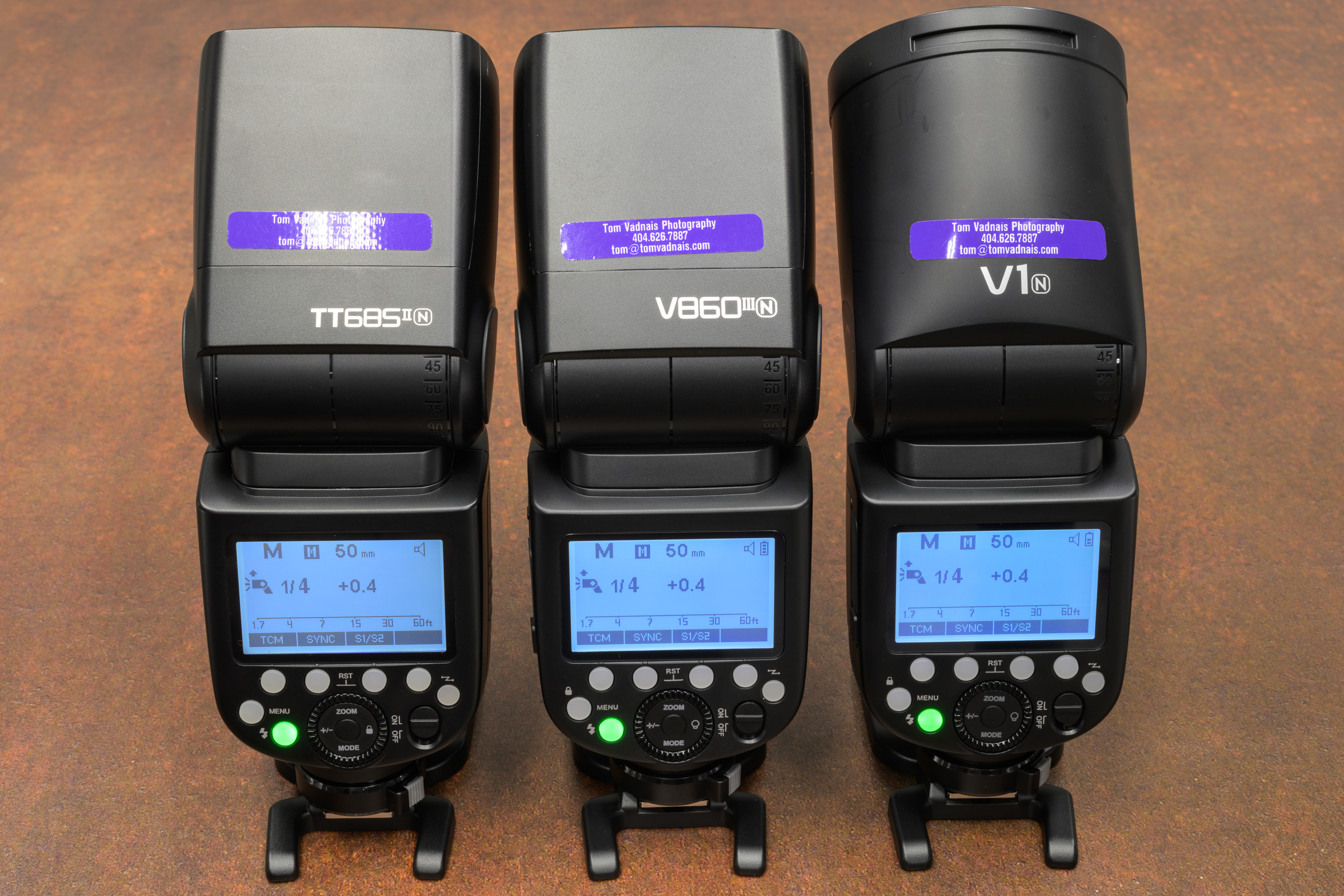
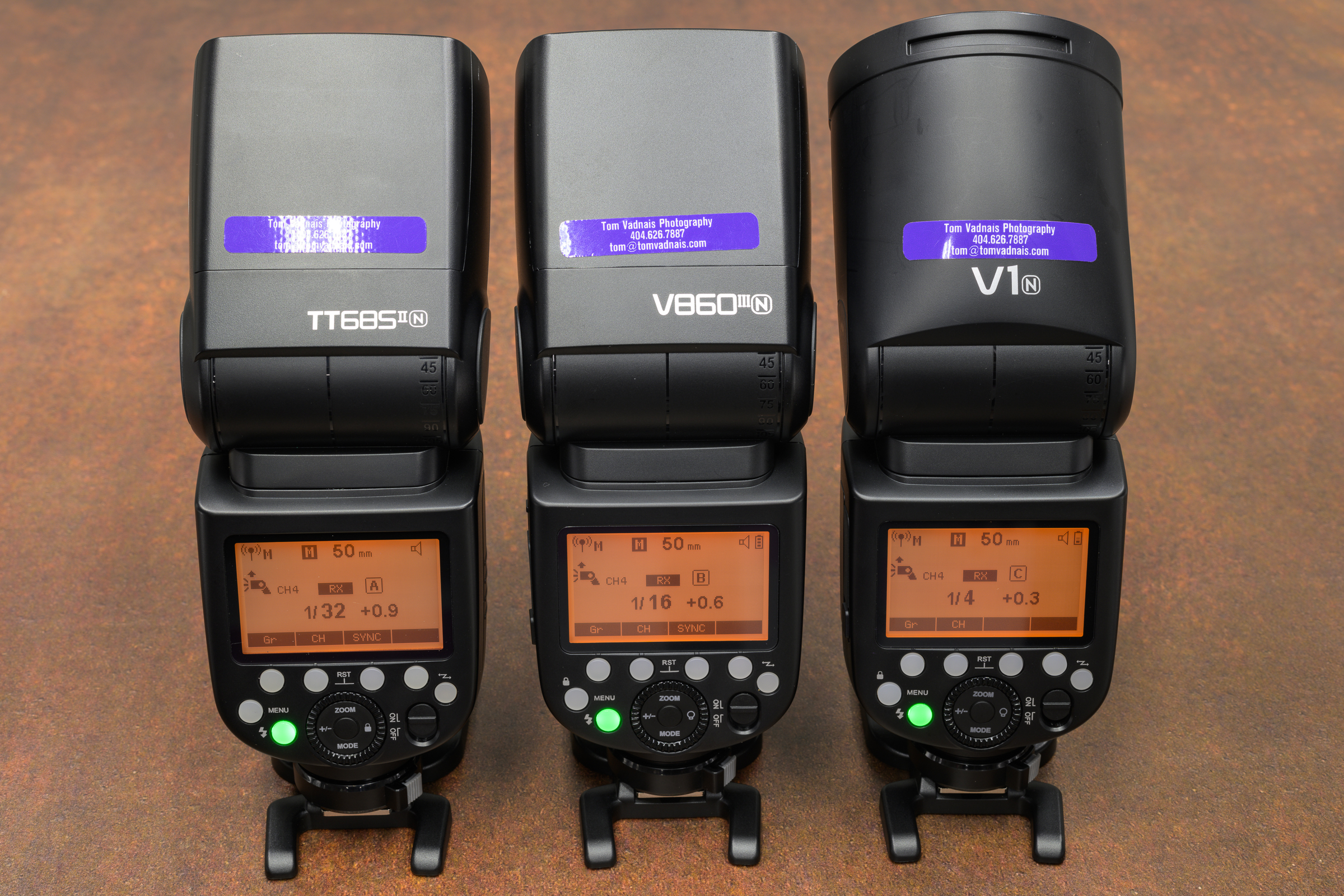
-12- All have the same intuitive interface and menu, and all are completely interchangeable in any multiple flash setup. All menus turn orange when any of the flashes is used in remote mode, which is a handy double-check. [Click on image to enlarge, then click on left arrow to return to post.]
Godox speedlite menu and interfaceGodox speedlte master menu. [Note: flash must be mounted in a camera hot shoe to function as a master flash.]Godox speedlite remote menu
Differences between models
-1- The most obvious difference is that the TT685ii and the V860iii have the same rectangular head, while the V1 has a round head. The shape of the head obviously affects the shape of the light output (and perhaps the catch light in a person’s eyes), but I’ve not experienced any meaningful differences in forensic use. In fact, my studio strobes are Profoto B3 Pro lights with round heads, while my most-used speedlite is the rectangular-headed TT685ii. Depending on the amount of light needed, I not only use them interchangeably, but I often use them together for a single image. [Click on image to enlarge, then click on left arrow to return to post.]
Godox speedlite flash head shapes
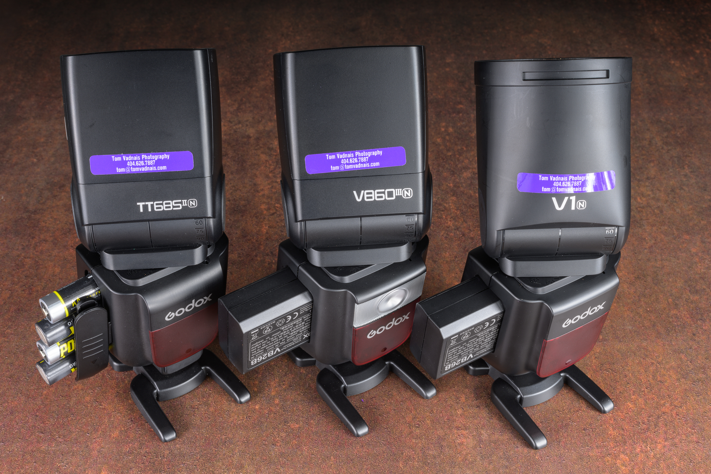
-2- Both the V860iii and V1 use proprietary lithium ion batteries. They come with one battery, but I highly suggest you buy a second for each flash to make sure you can finish your job.
The TT685ii uses four AA batteries (I’ve used Powerex Pro 2700 mAh rechargeable batteries for years). They are also compatible with external power packs for fast recharging and an almost unlimited number of flashes.
Depending on what I’m doing, I carry at least three TT685iiN flashes plus four sets of four AA rechargeable batteries between two small Think Tank battery pouches. They don’t weigh much and don’t take up much space. Best of all, if you’re out working and run out of batteries, including spares (I never have, but just in case), you can always use any universally available AA batteries. [Click on image to enlarge, then click on left arrow to return to post.]
Godox speedlite batteries with flashes on stands.
-3- Both the TT685ii and V860iii zoom from 20° to 200°, while the V1 zoom range is 28° to 105°. I use the zoom feature often to control the spread of light.
-4- The V860iii and V1 have an available modeling light, which the TT685ii lacks. I’ve never used a modeling light on studio strobes or speedlites, but if you do, this could be a deciding factor.
Please feel free to contact me if you have any questions. Happy flash shooting!
Photography may be the most important and most often used tool in the inspection and analysis of any accident reconstruction, product liability, or testing project. As professionals, our photographs need to be accurate, good quality, consistent, and useful. The key to all four is not usually new gear, but to improve the photographer. New gear won’t help much if you haven’t mastered the gear you already have.
This class is designed to help you consistently make good, accurate, and useful photos—every day in all kinds of light. We don’t always get to choose the locations, conditions, and light, but we must come back with usable photos in all conditions.
My next SAE C1729 Photography for Accident Reconstruction, Product Liability, and Testing class: https://www.sae.org/learn/content/c1729/ will be in Orlando, FL, from May 5 through 7, 2026. Here is the second of two posts showing some examples from the topics we’ll be discussing during the class.
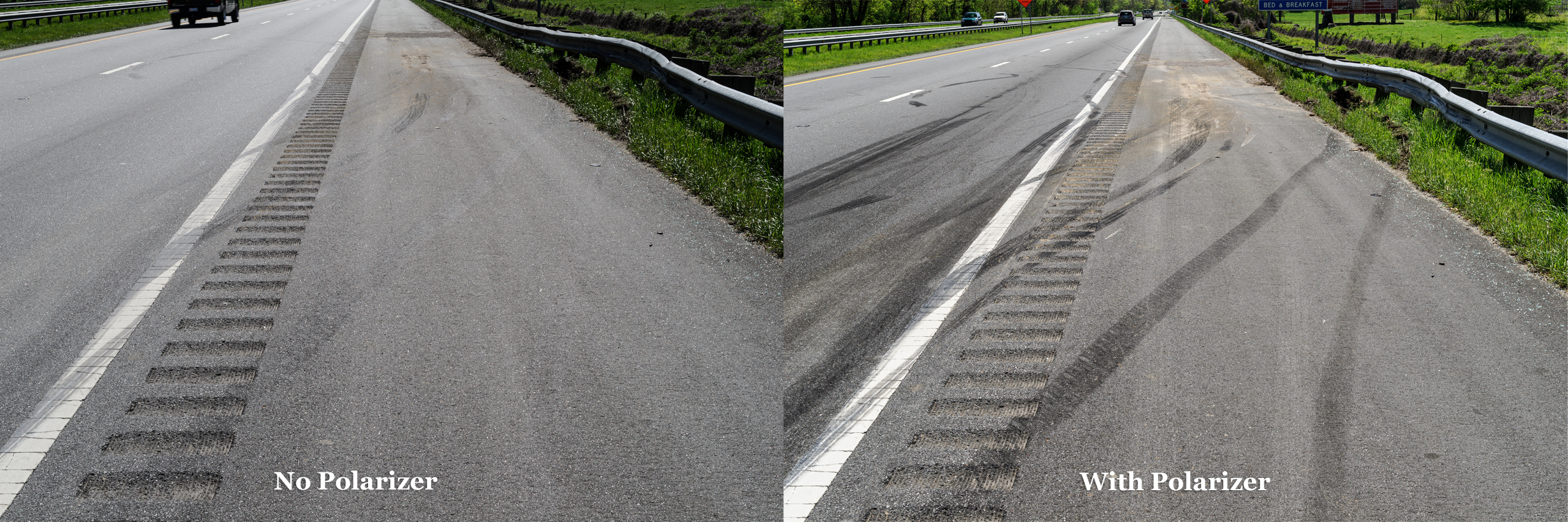
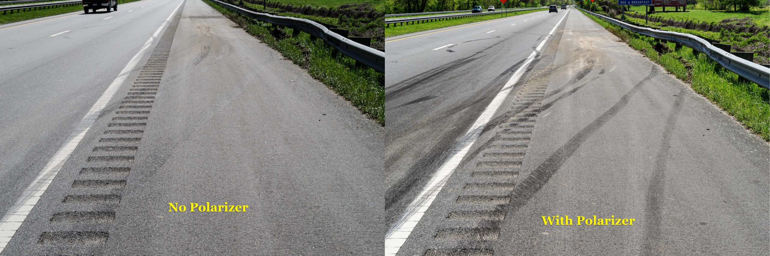
Tire Marks at Wreck Site with and without Polarizer
Both 1/80 sec, ISO 200 made using Nikon D3s with Nikon 24-70 mm f/2.8 lens at 50 mm. Left without polarizer f/14, 1/80, ISO 200. Right with polarizer f/11, 1/80, ISO 200. [Click on image to enlarge, then click on back arrow to return to this post.]Polarizer plus Fill Flash Bring Out Details in Car
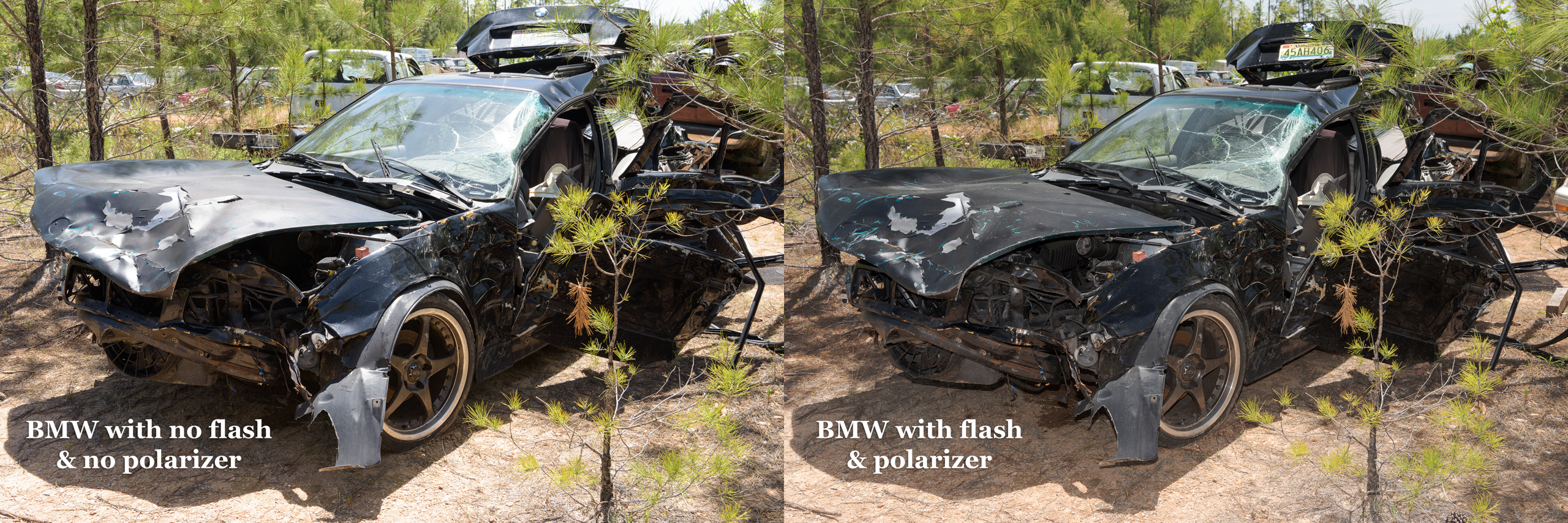
Left image without flash or polarizer. Right image with both. Both images were made with Nikon D810 with 24-70 mm lens at 40 mm with exposure 1/60 sec, ISO 160, and f/13 (w/o) and f/10 (w/). [Click on image to enlarge, then click on back arrow to return to this post.]Polarizer plus Fill Flash Reveals Critical Detail
Left image with no flash or polarizer. Right image with flash & polarizer. Note white scrapes on LR fender of right image that are obscured by glare on left image. Both made with ZEISS 50 mm f/2 macro lens on Nikon D850 at f/11, 1/25, ISO 64. [Click on image to enlarge, then click on back arrow to return to this post.]Side Lighting from Sun Illuminates Textures Hidden by Shade
Sun brought out texture and detail at White Sands, NM. Made with Nikon Z 8 and 24-70 mm f/2.8 lens at 33 mm with exposure f/11, 1/125/ ISO 64. [Click on image to enlarge, then click on back arrow to return to this post.]Scaling and Matching Photos Each Made Exactly Square to Camera
By ensuring scales were perpendicular when photographing both the car & the truck (three months later), allowed matching of lug nuts and scratch patterns. Both car & truck photos made with Nikon Z 7ii with Nikon Z 50 mm macro lens at f/13, 1/15 sec, ISO 64. [Click on image to enlarge, then click on back arrow to return to this post.]Faded Police Paint Marks Enhanced in Photoshop
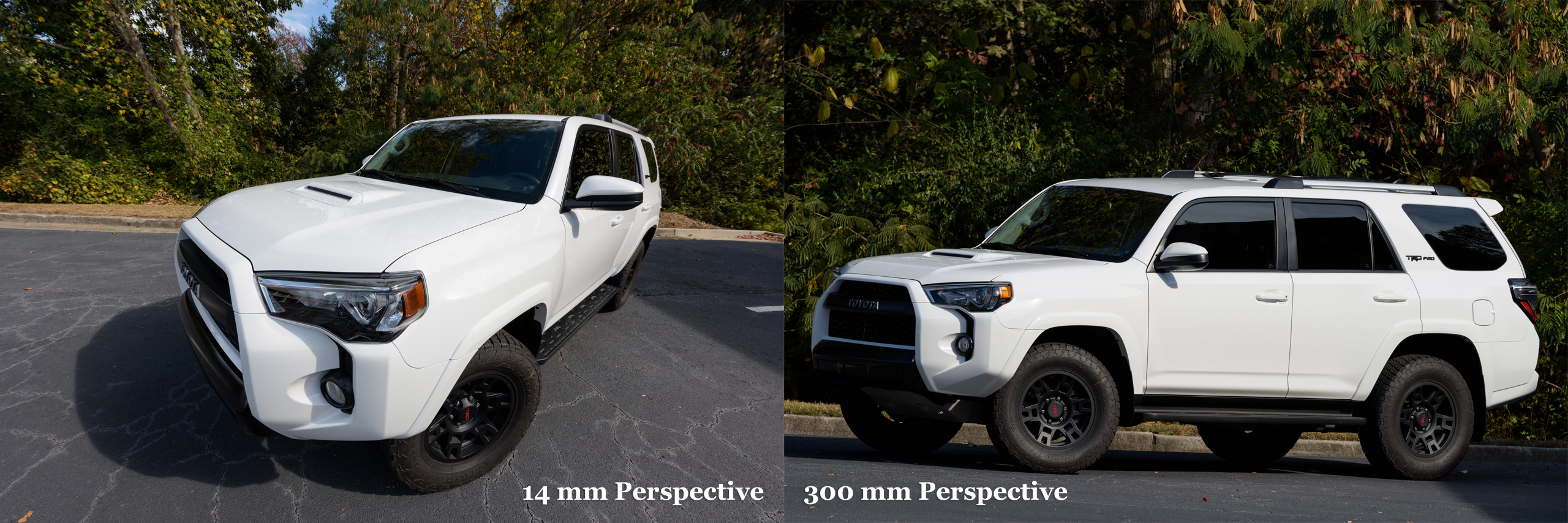
Police paint marks that had faded & were coated in road salt were enhanced in Photoshop. Made with Nikon D3 and Nikon 24-70 mm f/2.8 lens at 50 mm with exposure f/9m 1/80 sec, ISO 200. [Click on image to enlarge, then click on back arrow to return to this post.]Effects of Image Size and Viewing Distance on Perspective
A photo made with a super wide and another one made with a telephoto lens viewed from the same position shows distortion in each. But viewed from the proper viewing distance, they can both look “normal”. Both made with a Nikon D810 with exposure f/10, 1/80 sec, ISO 64.
Setup for Ensuring Measuring Gauge is Perpendicular to Camera
Using Wimberley The Plamp II to hold Alcoa rim wear gauge in proper position & perpendicular to camera for photograph. Both made with Nikon D850 & ZEISS 50 mm f/2 macro lens with exposure f/14, 1/60 sec, ISO 64. [Click on image to enlarge, then click on back arrow to return to this post.]Setting Custom White Balance with Flash for Proper Color
Screen shots of menu of Nikon Z 8 with Godox TT685Nii flash with Flash WB on left, then with custom (Preset) WB—with flash!—on right. [Click on image to enlarge, then click on back arrow to return to this post.]In the class, we will explore all of these—and more!—including demonstrations and hands-on photo sessions so these techniques become useful tools for your investigations and analyses. Please make sure to check out Part One of this post for some of the other topics we’ll cover: https://vadnaisengineering.com/2025/08/28/examples-from-my-sae-automotive-forensic-photography-class-c1729/
Most importantly, we’ll build a good foundation of exposure, focusing, and composition. All along we’ll emphasize the importance of proper tripod, polarizer, and flash (including multiple flash) use. Additionally, we’ll learn about both kinds of night photography (documenting evidence at night vs accurately recording ambient light). We’ll also see how to properly size an image and to determine the proper viewing distance for the proper perspective.
This first class offering of 2026 is conveniently offered in Orlando, which is easy to get to from anywhere in the country. Please let me know if you have any questions. I hope to see you there.
During my SAE classes (https://www.sae.org/learn/content/c1729/) and various other classes and presentations, I demonstrate and recommend Godox flashes—specifically the TT685ii. They are powerful, robust, and intuitive to use.
They have the same technical specifications and features (including: guide number 197 ft/60 m at ISO 100; fully rotating and tilting head; and, built-in radio transmitters/receivers) as the equivalent camera manufacturer’s flashes, but at only $129, cost only 12% to 22% as much! [Click on image to enlarge, then click on left arrow to return to this post.]
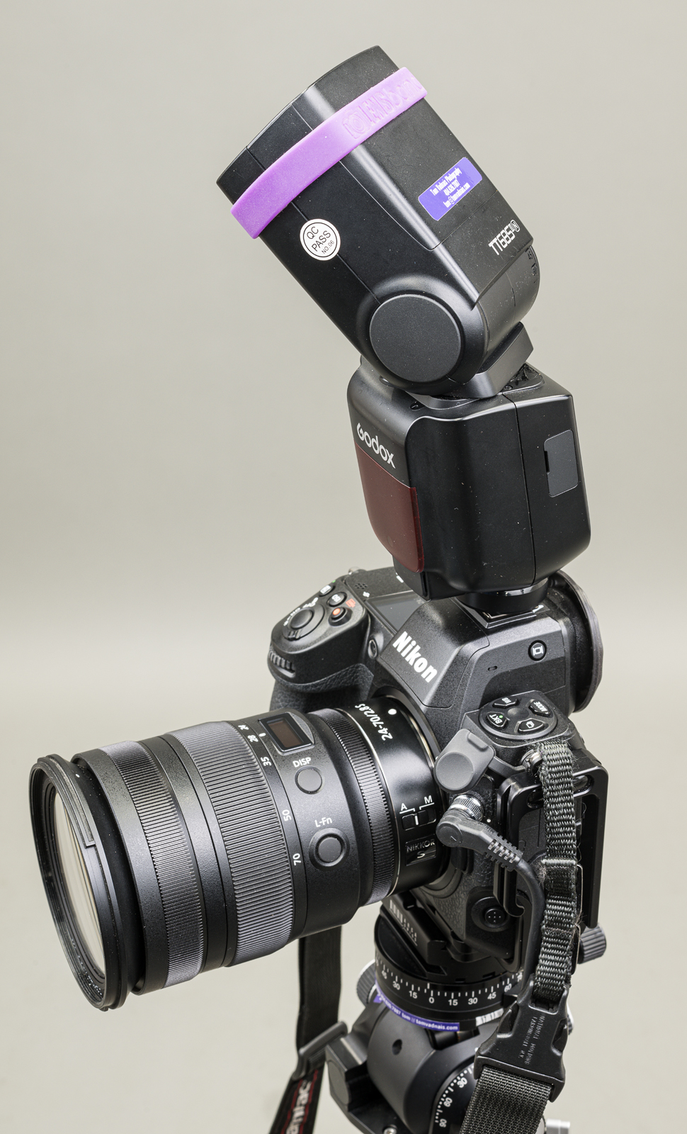
Godox TT685iiN mounted on Nikon Z 8, with flash head tilted up and rotated right.
In other words, you can buy 4.5 to 8.5 Godox TT685ii flashes for the price of a single camera brand flash. This means you can buy two (or three) Godox TT685ii flashes and still have plenty of money for rechargeable batteries and a charger for them. (Of course, you’ll need the batteries and a charger regardless of which flash you buy.)
For off-camera use, I highly recommend getting at least two of these flashes. I always carry at least three TT685iiN flashes, along with an X3 N hot shoe trigger so I can use all flashes off-camera if necessary. (I also use the X3 N hot shoe trigger with my Godox MF-12 macro flashes. I’ll describe them in a future post.)
Important: To use TTL (through-the-lens) flash exposure, make sure you buy flashes designed for use with your camera brand.For example, I shoot Nikon, so I use the TT685iiN versions. Godox makes versions compatible with Nikon, Canon, Sony, FUJIFILM, and Olympus/Panasonic. This allows the flashes to be used in TTL mode. [Click on image to enlarge, then click on left arrow to return to this post.]
Godox TT685 Flash Hot Shoes for different camera brands. (Made with ZEISS Milvus 50 mm f/2 Macro lens on Nikon D850 at f/16, 1/200 sec, ISO 64. One Profoto B1x strobe to each side triggered by a Nikon SB-910 flash in the camera’s hot shoe.)
In the image above, the flash at the far left (“M”) is a full manual(non-camera specific, non-TTL) model. It has a single contact to allow the camera to fire the flash with fully manual settings (except with Sony cameras). The other flashes, from left to right, are Nikon, Canon, FUJIFILM, Olympus/Panasonic, and Sony.
Note that any flash may be used in full manual mode with any camera brand—except with Sony. The pin that fires the flash is offset on the Sony proprietary hot shoe (far right in photo above), so it doesn’t reliably fire a non-Sony flash—if fires it at all. Sony’s proprietary hot shoe means a Sony-compatible flash must be used on a Sony camera. It also means that Sony-specific flashes will not work in non-Sony camera hot shoes (although they will work as remote flashes).
I’ve been using TT685iiN flashes (I have six of them) almost daily since their release almost four years ago without a single problem or malfunction. I previously used the original TT685N flashes (I have three of them) without any issue. I also have bought another twenty or so TT685ii flashes for other camera brands for students to use in my classes. (Full disclosure: I am not affiliated with Godox. I just use and like their stuff!)
Note: The Godox V860iii is identical to the TT685ii, but it includes a proprietary rechargeable lithium-ion battery, and costs $100 more. The Godox V1 is identical to the V860iii, but has a round head and costs $30 more than the V860iii and $130 more than the TT685ii). All three flash models are fully interchangeable as on-or-off camera flashes with the Godox radio control system. A future post will illustrate and describe the differences between the Godox flash models.
Regardless of what flash brand you get, I strongly encourage you to get at least two flashes. Two flashes allow you to use the off-camera flash to fill in shadows and for side lighting to bring out textures, stampings, and raised lettering or elements. You’ll find they are something you’ll use almost daily in your forensic photography.
Takeaways:
-1- Godox TT685ii, V860iii, and V1 are well-made, robust, powerful, and intuitive flashes that cost much less than, but have the same performance specs as, flashes sold by camera manufacturers.
-2- This significantly lower cost makes it easy to buy two or more flashes, plus rechargeable batteries and a battery charger, for less money than a single camera manufacturer’s flash.
-3- Two flashes allow you to use the off-camera flash to fill in shadows and for side lighting to bring out textures, stampings, and raised lettering or elements.
-4- You need to make sure at least one of your flashes is compatible with your camera brand so you can use TTL (through-the-lens) flash exposure.
-5- If you don’t need or want light coming from a flash in your camera’s hot shoe, adding an X3 or X3 Pro hot shoe trigger will allow you to use all your flashes off camera, even in TTL.
My next SAE C1729 Photography for Accident Reconstruction, Product Liability, and Testing class: https://www.sae.org/learn/content/c1729/ will be in Orlando, FL, from May 5 through 7, 2026. Here is the first of two posts showing some examples from the topics we’ll be discussing during the class.
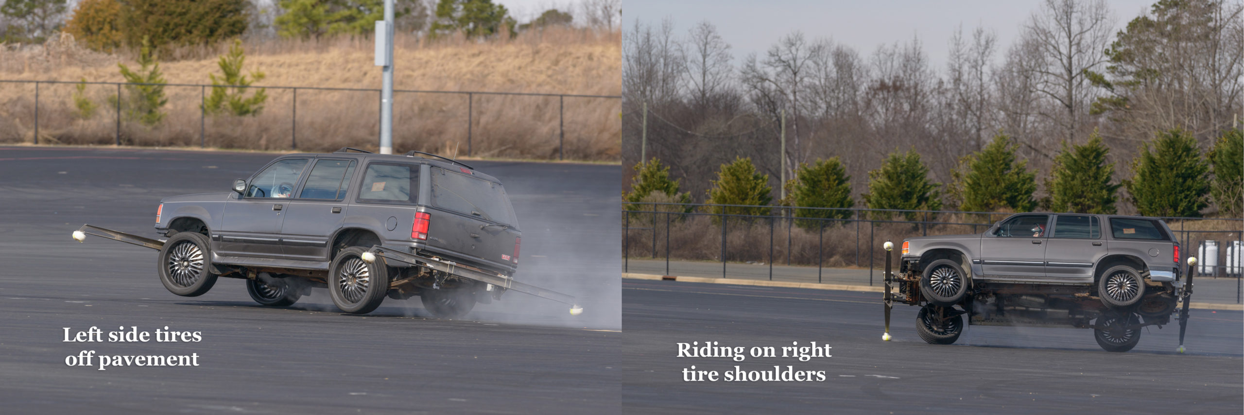
Tracking a Vehicle During Testing
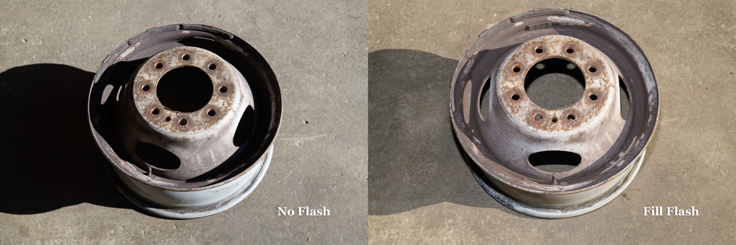
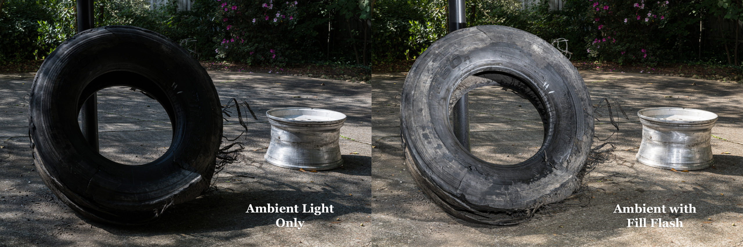
Tracking by panning with Nikon D800E with 300 mm f/2.8 lens at f/6.3, 1/640 sec, ISO 400. [Click on image to enlarge, then click on back arrow to return to this post.]Using Fill Flash to Show Details in Shadows
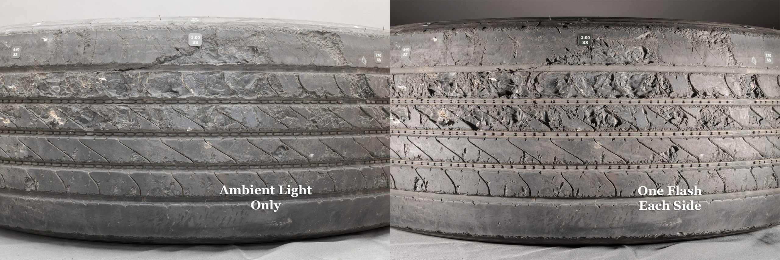
Both with Nikon D850 and ZEISS Milvus 50 mm f/2 macro lens. Left side: No flash at f/10, 1/60 sec, ISO 64. Right side: Fill flash at f/11, 1/80 sec, ISO 64. [Click on image to enlarge, then click on back arrow to return to this post.]Showing Depths of Abrasions and Damage Using Two Flashes vs Ambient
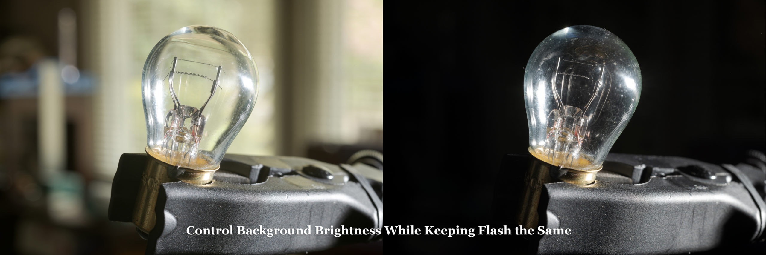
Left side: Ambient only; Right side: One Profoto B1x strobe on either side of tread. Both with Nikon D850 with ZEISS Milvus 50 mm f/2 macro lens at f/16, ISO 100, 4.0 sec left & 1/200 sec right. [Click on image to enlarge, then click on back arrow to return to this post.]Controlling Background Brightness while Keeping Flash the Same
Both made with Nikon D850 and ZEISS Milvus 50 mm f/2 macro lens at f/14, ISO 64 with flash in hot shoe. Left side: 2.0 second exposure for bright background. Right side: 1/250 sec exposure for dark background. Background itself didn’t change. [Click on image to enlarge, then click on back arrow to return to this post.]Keeping Background Brightness the Same while Adding Fill Flash
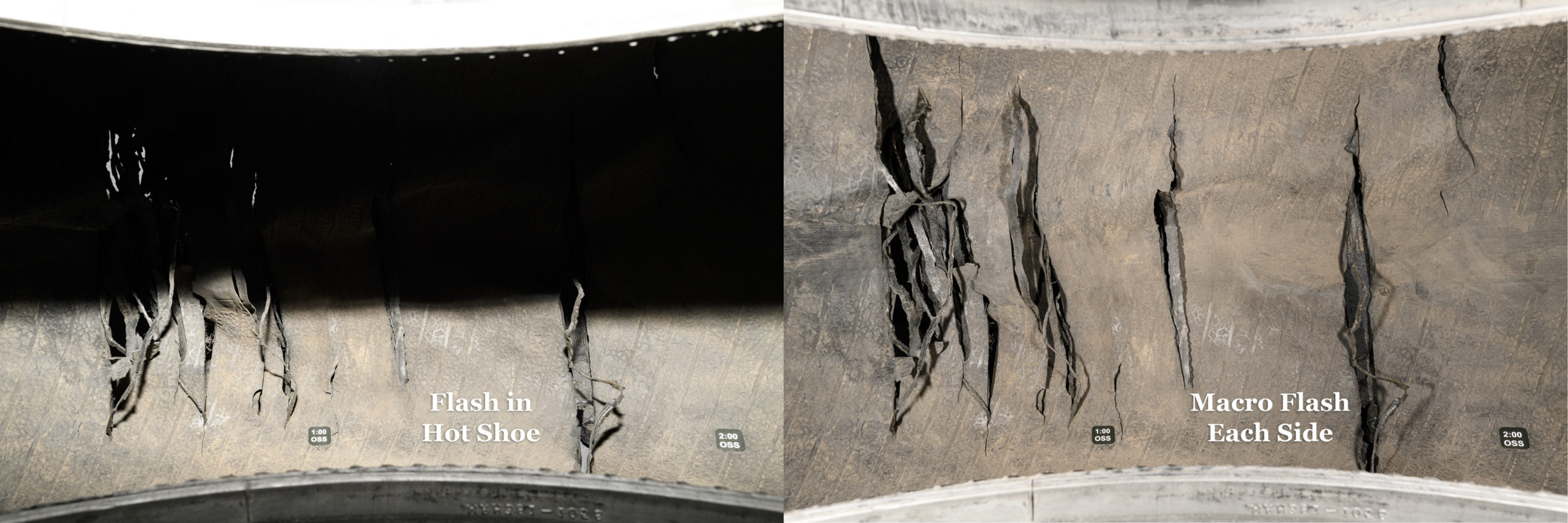
Left side: Ambient light only. Right side: Same ambient light with added fill flash. Both with Nikon Z 8 with ZEISS Milvus 50 mm f/2 macro lens at f/16, 1/25 sec, ISO 64. [Click on image to enlarge, then click on back arrow to return to this post.]Using Macro Flashes vs On-Camera Flash for Recessed Subjects
Left side: flash in hot shoe (Godox TT685IIN) with head tilted -7°; Right side: one small macro flash (Godox MF-12) on either side of lens—no light from hot shoe flash. Both with Nikon D850 with ZEISS Distagon 25 mm f/2 lens at f/16, 1/200 sec, ISO 64. [Click on image to enlarge, then click on back arrow to return to this post.]Unintended Deception from Camera Position, Even with Same Lens
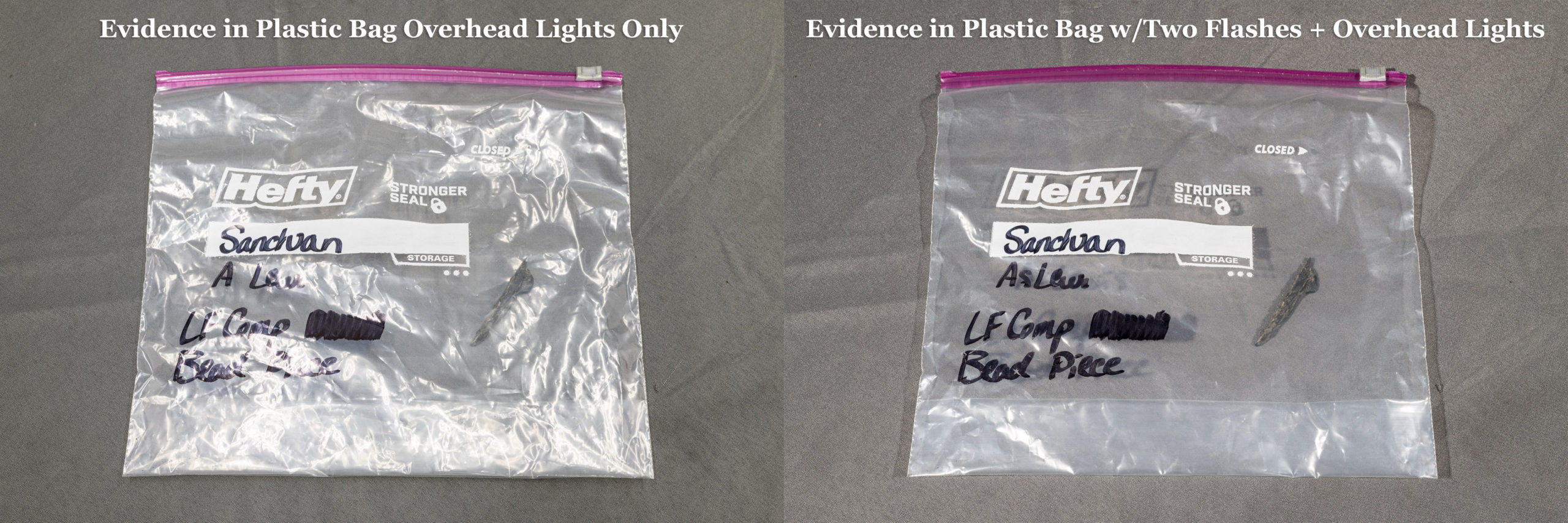
Both made with Nikon D850 with ZEISS Milvus 50 mm f/2 macro lens with fill flash. Left side: f/13, 1/40 sec, ISO 125. Right side: f/16, 1/30 sec, ISO 200. [Click on image to enlarge, then click on back arrow to return to this post.]Eliminating Glare Such As On Plastic Evidence Bag Using Two Flashes
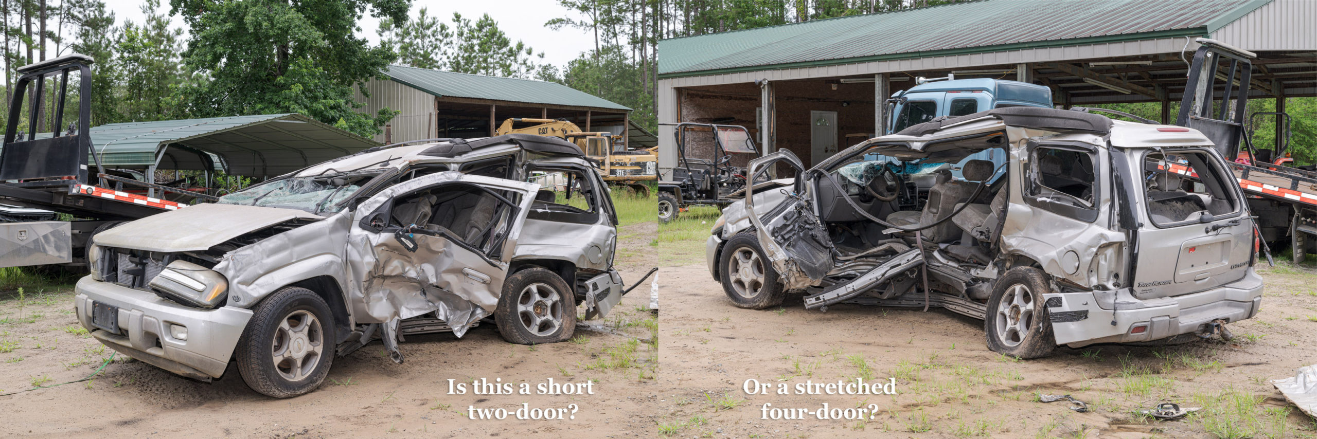
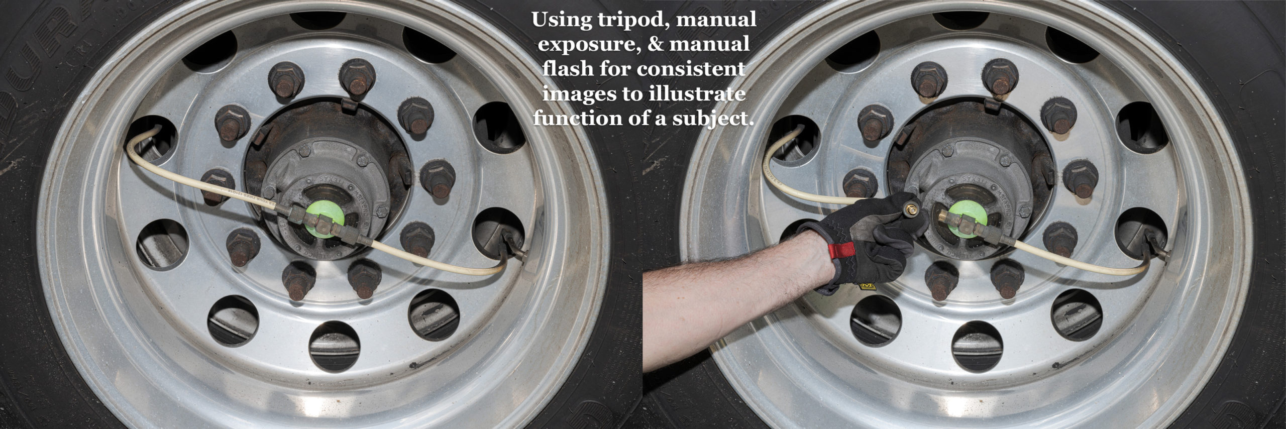
Both made with Nikon D850 with ZEISS Milvus 50 mm f/2 macro lens. Left side: Ambient only (f/16, 1.0 sec, ISO 16). Right side: Ambient with one flash at right and one at left (f/16, 1/200 sec, ISO 64). [Click on image to enlarge, then click on back arrow to return to this post.]Using Tripod, Manual Exposure, & Manual Flash to Ensure Consistent Images for Demonstrating Function of Subject
Using a tripod, manual exposure, and manual flash ensure consistency between images. Both made with Nikon D850 and ZEISS Milvus 50 mm f/2 macro lens at f/16, 1/40 sec, ISO 64 plus flash. [Click on image to enlarge, then click on back arrow to return to this post.]Some of you may have noticed that—except for the Explorer testing, the Trailblazer, and the onboard tire inflation system images—each pair of images had the same exact composition. Only the lighting changed. This was only possible by using a tripod. Tripod use will be another area of concentration and practice in the class. Hopefully, you’ll learn to love using your tripod like I love using mine.
I’ll post another set of photograph pairs later to illustrate additional areas we’ll cover in the class.
In the meantime, please don’t hesitate to contact me by e-mail or phone if you have any questions or would like more information. I look forward to seeing you in Orlando, FL, in May. For more details or to register for the class, here is the link for the class: https://www.sae.org/learn/content/c1729/.
On Tuesday, May 6, 2025, I will be teaching a flash workshop at the BioCommunications Association (BCA) BIOCOMM 2025 conference in Tucson, AZ: https://bca.org/BIOCOMM-2025-Program#vadnais. [Click on image below to enlarge, then click left arrow to return to this post.]
Godox TT685 flash display in manual mode.
Flash is not only the most available light, but you have complete control over it. This will be a hands-on workshop to help you see how easy, straightforward, and, dare I say, fun, it is to use flash—even off camera and multiple flashes. We will learn by doing the following exercises:
– Setting custom white balance with flash(es).
– Photographing the same subject in ambient (no flash), full flash (no ambient), and fill flash (ambient augmented with flash).
– Photographing textures, including sunken stampings, raised icons, small details, & sponges using off-camera flash with a flash trigger or second on-camera flash to fire it.
– Adjusting brightness of ambient light in relation to flashed subject (turning day into dawn or to night.)
– Using reflectors or second flashes to fill in shadows opposite of the main flash.
– Eliminating reflections off clear plastic bags (or any other translucent material) using two off-camera flashes and a camera-mounted flash or flash trigger.
– Demonstrating the effects of background color on your subject.
– Manual vs TTL: when to use each, and what to do when TTL doesn’t seem to work.
– Diffusing light from the flash for softer light and to reduce or eliminate hot spots.
I will be bringing extra flashes for you to use in case you don’t have a flash, want to try a new flash, or need a second (or third) one for the workshop exercises. [Click on image below to enlarge, then click left arrow to return to this post.]
Godox TT685 Flash Hot Shoes for different camera brands. (Made with ZEISS Milvus 50 mm f/2 Macro lens on Nikon D850 at f/16, 1/200 sec, ISO 64. One Profoto B1x strobe to each side triggered by a Nikon SB-910 flash in the camera’s hot shoe.)
If you would like to purchase flashes beforehand, I highly recommend the Godox TT685II for your camera. These Godox flashes have the same specs as the top flashes from each camera manufacturer (Guide Number 197 feet/60 meters at ISO 100 with flash head zoomed to 200 mm).
Some of the best features of the TT685II include:
– Intuitive controls for single (on-camera), off-camera, and multiple flashes.
– Built-in radio controls for multiple flashes.
– Easy rotating and tilting of flash head, including to a -7° “macro” angle.
– Full TTL (when you buy the versions for your camera body).
– Comes with nice case and stand.
I have been using these flashes in the field and in the lab for more than three years without a glitch. Best of all, they only cost between 1/4 and 1/8 of what camera manufacturers charge for their equivalent flashes. You can buy two or three Godox TT685II flashes and still have plenty of money for batteries and portable light stands. I recommend getting three flashes (you’ll see why in the class), but you can get by with two.
I also highly recommend you use rechargeable batteries. I have been using Powerex Pro rechargeable for well over a decade without a failure or problem. They hold their charges for a long time and recharge quickly.
Please contact me if you have any questions about the workshop. I hope to see you there!
Both 1/80 sec, ISO 200 made using Nikon D3s with Nikon 24-70 mm f/2.8 lens at 50 mm. Left without polarizer f/14. Right with polarizer f/11.
[Click on image to enlarge, then click back arrow to return to this post.]
SAE will once again be hosting my class C1729 entitled Photography for Accident Reconstruction, Product Liability, and Testing from March 18-20, 2025. This time it will be in Peoria, AZ.
We will start with the basics of camera setup, menus, exposure, and gear (especially flashes, tripods, and polarizers). We will build on that with composition and focusing. There will be plenty of comparison images between bad and good images so we can see how and why images can be improved to show more detail and become more useful.
We will also discuss the special requirements and procedures for macro (close-up) and night photography, along with the importance of proper perspective. Finally, we will review file handling and post-processing.
We will have extended hands-on sessions to apply what we’ve learned to real world situations. As always, I will be bringing additional flashes, tripods, and polarizers for those who don’t have them, or who don’t have good ones, or who want to try new equipment.
You may be aware that light (whether ambient, flash, or a continuous light source) reflecting off a colored ceiling or wall will reflect that color into your photograph. Likewise, color reflections from a background will adversely cause your subject to take on a tint that isn’t actually present.
In the best case scenario, you may only have to explain why your photos of a subject have erroneous colors. In the worst cases, those erroneous color tints can lead to erroneous conclusions. For example, a tire photographed on a blue background will likely take on a blue color cast. This could be mistakenly interpreted as evidence that the tire or tire piece exhibited signs of high heat, which includes the “bluing” of certain surfaces in the tire.
Setting a custom white balance (WB) with a calibrated white or gray target won’t remove the unwanted background color casts because the target is usually placed between the light source(s) and the subject. In that position, it would yield a proper WB for the light falling on the target, but it wouldn’t receive the tinted reflections of light from the background. As custom WB is designed to do, it would properly render the actual reflected color cast on the subject—even if is unwanted.
But if the WB target was in position to receive background reflected light, the custom WB function would try to neutralize that color cast, which would adversely affect every other color. That would be the worst of both worlds.
Let’s see how different color backgrounds work in practice.
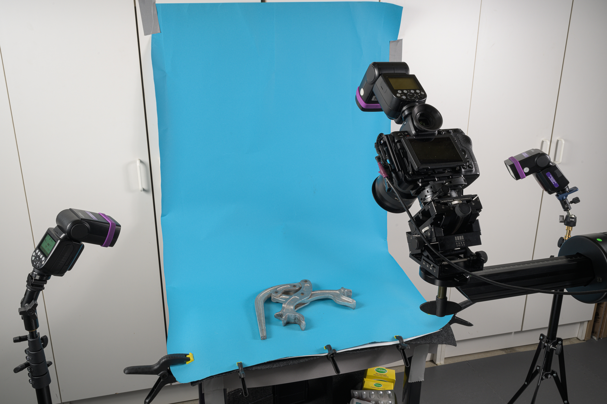
For these examples, I photographed a manual tire spreader on different solid color backgrounds in my Studio Lab. [Click on photo below to enlarge, then click on back arrow to return to this post.]
Tire spreader on background paper lit by two Godox TT685IIN flashes triggered by another Godox TT685IIN on a Nikon Z 8 with a ZEISS Milvus 50 mm f/2 macro lens. Note: the on-camera flash was used only as a trigger for the two remote flashes, but did not add any light to the subject itself.
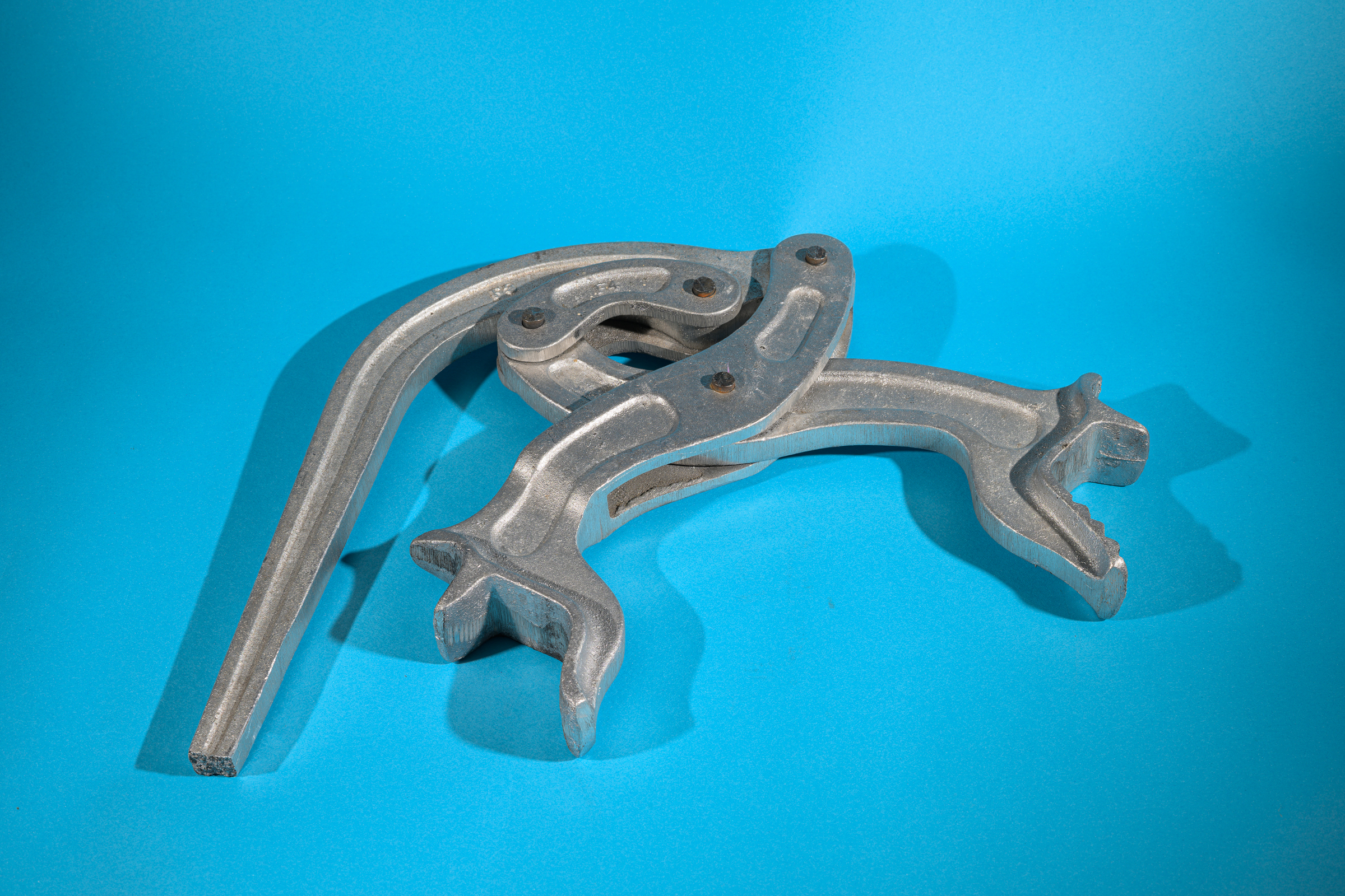
The tire spreader was made from uniformly-colored cast metal. It had no paint or other color applied to it. Before making any of the photographs below, I set a custom WB using a Calibrite gray WB target.
Made with Nikon Z 8 with ZEISS Milvus 50 mm macro lens & two Godox TT685IIN flashes. f/16, 1/200 sec, ISO 64.
Here is the resulting photograph with the blue background paper. It’s easy to see the blue cast in the vertical surfaces, but even the horizontal surfaces have picked up an unwanted and incorrect blue tint. [Click on photo above to enlarge, then click on back arrow to return to this post.]
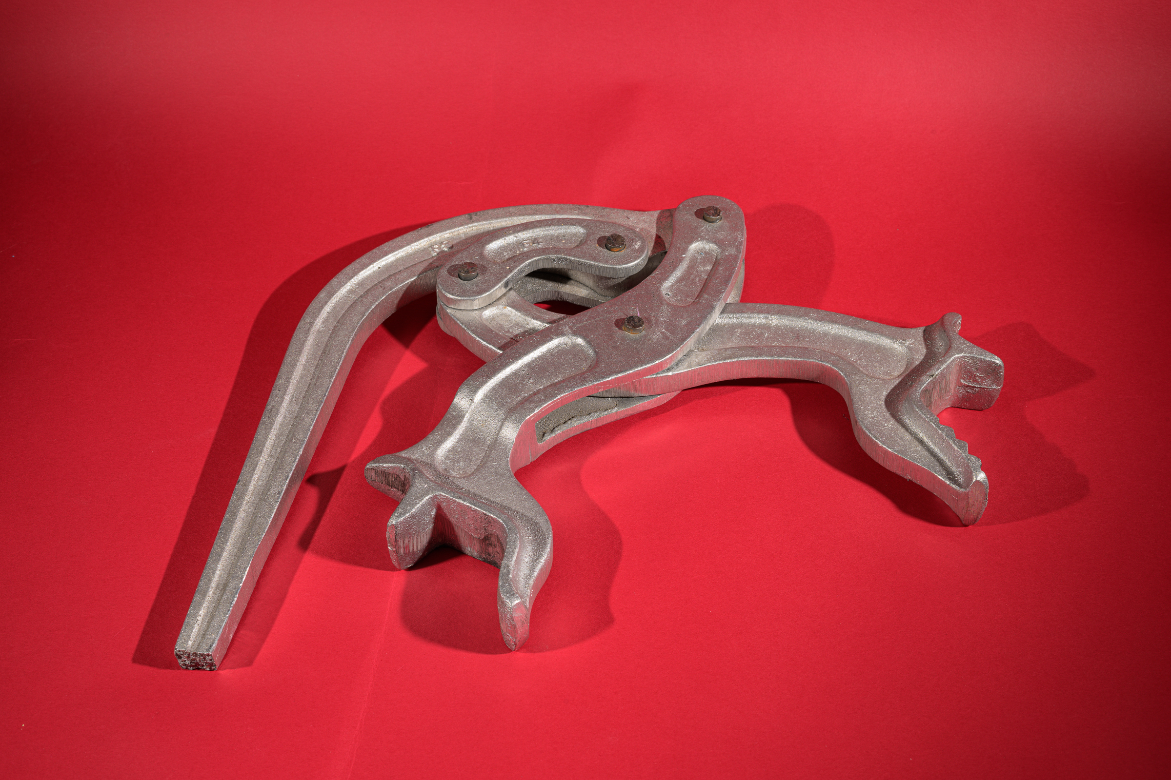
Made with Nikon Z 8 with ZEISS Milvus 50 mm macro lens & two Godox TT685IIN flashes. f/16, 1/200 sec, ISO 64.
Replacing the blue background paper with red changed the improper color cast from blue to red. Again, the tint was most evident in the vertical surfaces, but was also noticeably visible on the more textured horizontal surfaces—especially when compared with those same surfaces in the blue background photo. [Click on photo above to enlarge, then click on back arrow to return to this post.]
Made with Nikon Z 8 with ZEISS Milvus 50 mm macro lens & two Godox TT685IIN flashes. f/16, 1/200 sec, ISO 64.
Replacing the red background paper with white removed the color cast, but now the vertical surfaces were significantly brighter than the horizontal surfaces. This was not what the spreader looked like if you held it in your hands. [Click on photo above to enlarge, then click on back arrow to return to this post.]
Made with Nikon Z 8 with ZEISS Milvus 50 mm macro lens & two Godox TT685IIN flashes. f/16, 1/200 sec, ISO 64.
Changing to a black background paper retained the neutrality of the white paper, but now the shadows were darker than they appear to the naked eye. In fact, black cards or black reflectors are often specifically used to absorb light and create deeper shadows. [Click on photo above to enlarge, then click on back arrow to return to this post.]
Made with Nikon Z 8 with ZEISS Milvus 50 mm macro lens & two Godox TT685IIN flashes. f/16, 1/200 sec, ISO 64.
A neutral gray background paper added no color cast, nor did it overemphasize highlights or shadows. In conjunction with a custom white balance, a neutral gray background provides the most natural and true colors, textures, and shapes of your subject. [Click on photo above to enlarge, then click on back arrow to return to this post.]
After testing and measuring numerous gray background papers, I found Superior Seamless #4 Neutral Gray Seamless Paper to be the most neutral gray background paper available. I’ve been using it ever since. Here’s a link to that paper: https://superspec.com/product/neutral-gray-seamless-paper/
Takeaways:
-1- Non-neutral background colors negatively affect the accurate rendition of your subject in a photograph.
-2- Colored backgrounds impart their colors onto your subject.
-3- Setting a custom white balance (WB) with a calibrated white or gray target won’t remove the color cast, but will accurately capture the actual reflected color. This is as it should be since capturing accurate actual color is the purpose of setting a custom WB.
-4- Although black and white are neutral tones, black overemphasizes shadows while white overemphasizes highlights.
-5- A neutral gray background gives the most natural and true colors, textures, and shapes of your subject. It’s all I ever use for any forensic photography.
There is still time to register for one or more of the forensic photography short courses being offered next week. Each will be from 8:00 am to 12:00 noon EST. They are:
Monday, January 20: Using Flash in Forensic Photographyby Tom Vadnais.
Tuesday, January 21: Close-Up and Macro Evidence Photography by Jerry Narowski.
Wednesday, January 22: Precision Lighting for Evidence Photography by Gale Spring.
Thursday, January 23: Photoshop Enhancement Techniques by George Reis.
Each four-hour course is only US$75, and each qualifies for continuing education credits after a short test and assignments are completed. Best of all, you’ll immediately be able to apply what you learn in each class in your daily work.
Here is a link for the descriptions and registrations for the four short courses—one per day next Monday through Thursday: https://www.ai2-3d.com/fps-courses
The Symposium will be held each of those days after the short courses. For the schedule and to register for the Symposium itself, please follow this link: https://www.ai2-3d.com/fps2025-schedule
You’ll need to register separately for each short course and for the Symposium itself. Since they’re all virtual, you don’t even have to travel!
(Note: This post incorporates several important fundamentals along with the discussion of controlling sun stars. As always, it’s all summarized in the Takeaways at the end.)
A previous post illustrated how the number of aperture blades affected the number of rays produced in a sun star. As discussed, sun stars are created from bright spots of light in an image when the lens aperture is stopped down. While prominent sun stars might be desirable for landscape or creative photographs, they are usually unwanted in forensic photos. In fact, there have been instances where photographs with distinctive sun stars have been limited or disallowed. Here’s how to control—or even eliminate—their prominence.
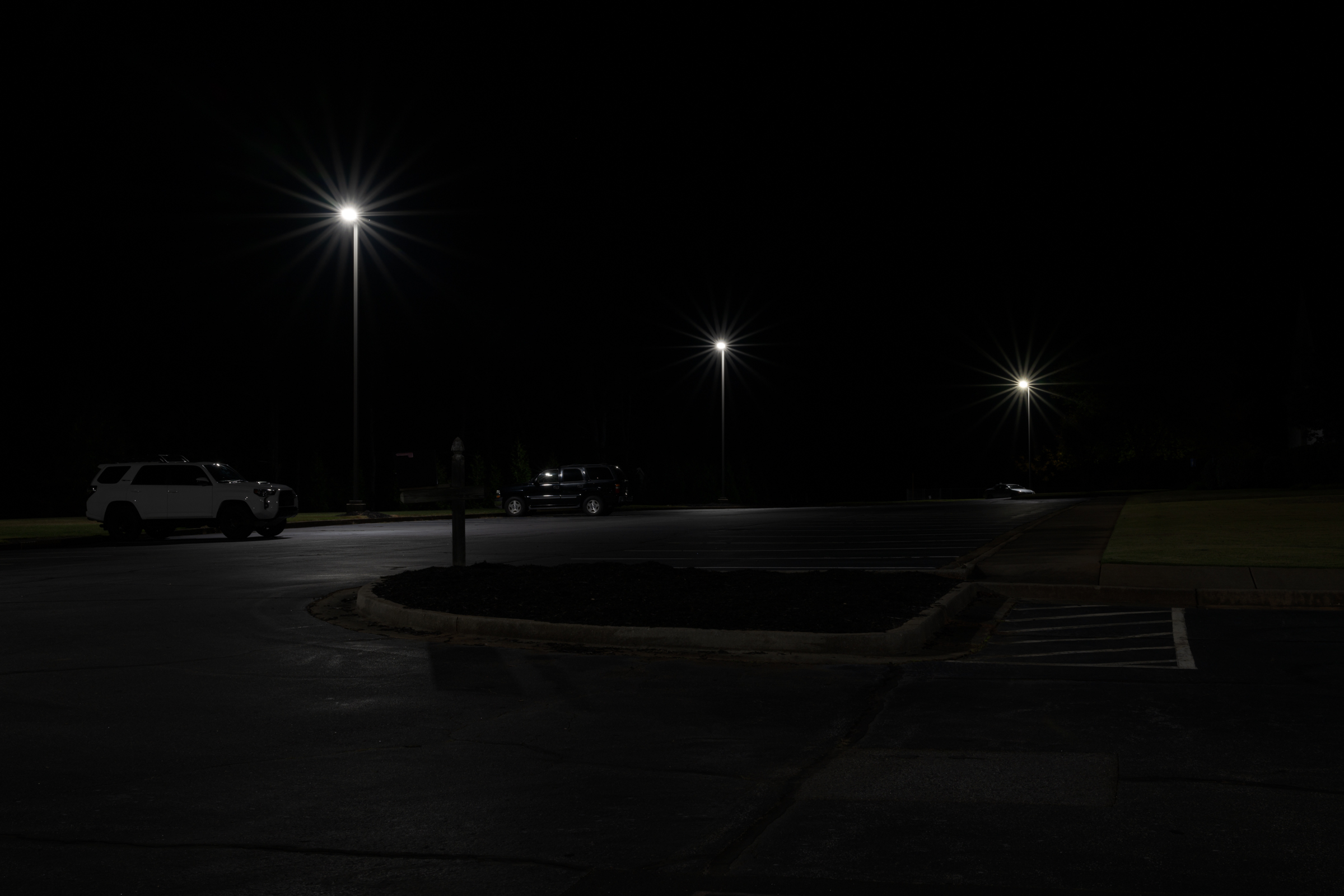
There were three small, distinct bright light sources in the following night scene. A series of images was made at every whole aperture from f/16 through f/2. (As a reminder, there are six stops up from f/16: f/11, f/8, f/5.6, f/4, f/2.8, f/2.) Only four of the seven total images—each two stops apart—will be shown below. The other three intermittent images fit in the progression as you’d expect from what you’ll see below.
This first image was made with the aperture stopped down to f/16. As expected, the sun star rays were most distinct at this aperture. [Click on image to enlarge, then click on back arrow to return to this post.]
Sun Stars at f/16 made with Nikon Z 8 with Nikkor Z 50 mm f/1.2 S lens at f/16, 2.5 sec, ISO 64.
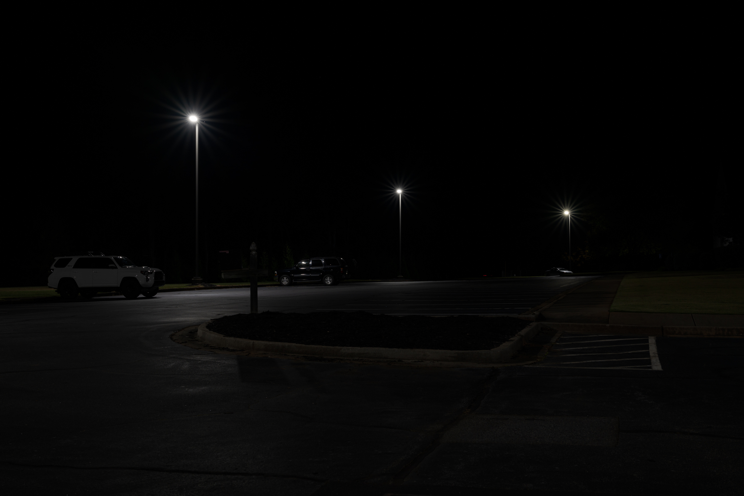
Opening up two stops to f/8 noticeably reduced the sun star effect. [Click on image to enlarge, then click on back arrow to return to this post.]
Sun Stars at f/8 made with Nikon Z 8 with Nikkor Z 50 mm f/1.2 S lens at f/8, 0.6 sec, ISO 64.
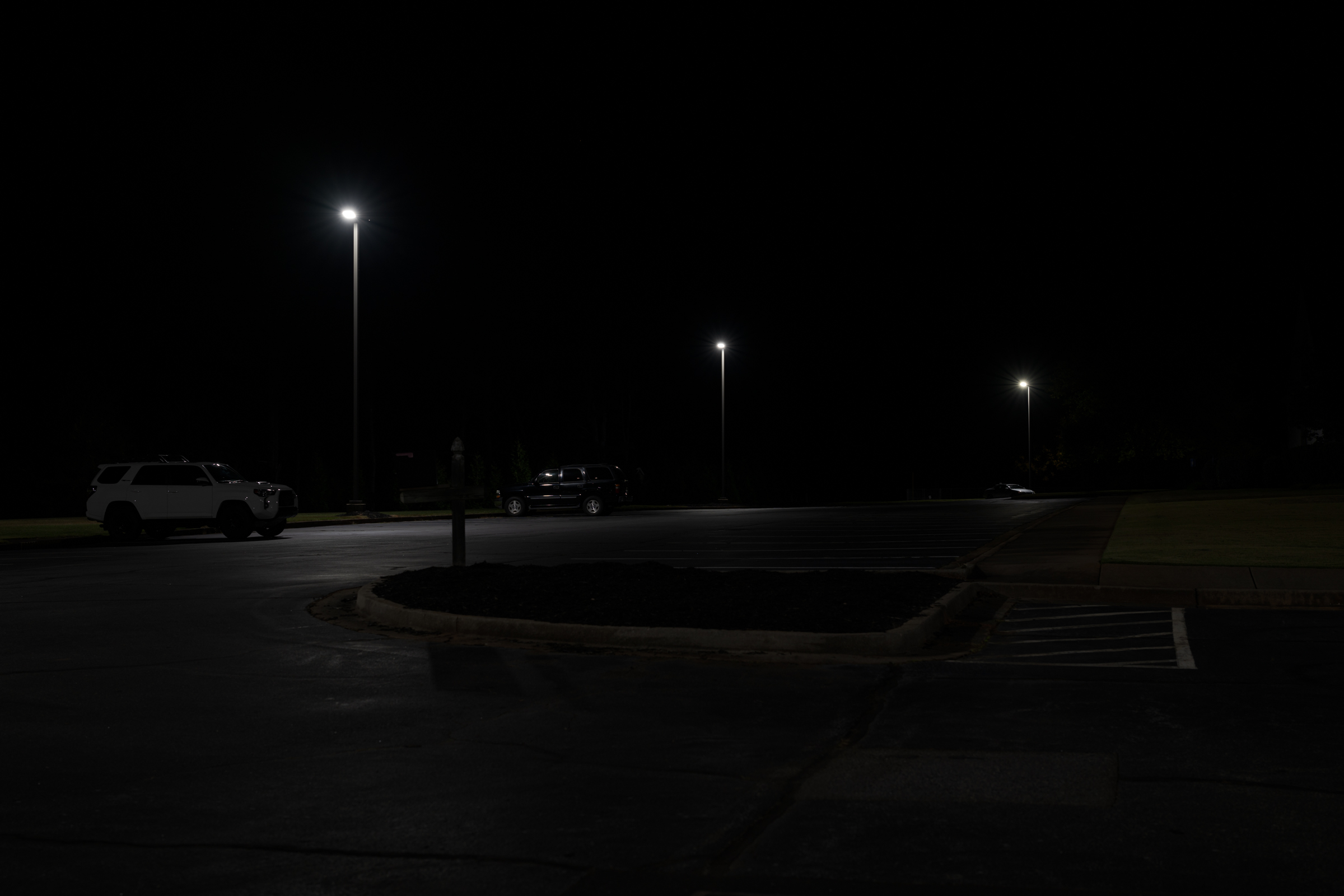
Opening up two more stops to f/4 almost completely eliminated the sun star effect. This should be acceptable for any foreseeable use. [Click on image to enlarge, then click on back arrow to return to this post.]
Sun Stars at f/4 made with Nikon Z 8 with Nikkor Z 50 mm f/1.2 S lens at f/4, 1/6 sec, ISO 64.
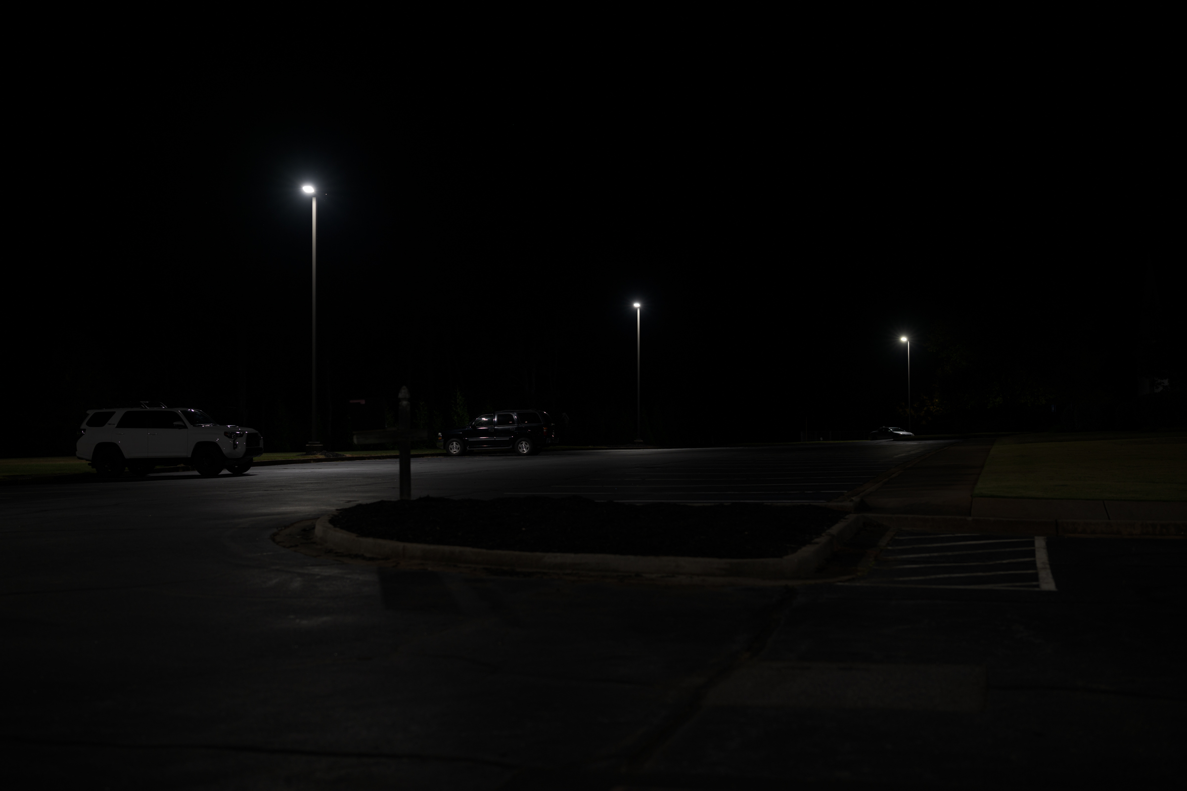
Finally, opening up yet two more stops to f/2 eliminated any trace of sun star rays. [Click on image to enlarge, then click on back arrow to return to this post.]
Sun Stars at f/2 made with Nikon Z 8 with Nikkor Z 50 mm f/1.2 S lens at f/2, 1/25 sec, ISO 64.
As you can see, the wider open the aperture (which means the lower the f-number), the less pronounced are the sun stars. But you can’t just adjust your aperture to either intensify or to eliminate sun stars. Whether it is daytime or nighttime photography, changing your aperture affects your image in two main ways: exposure and depth of field (DOF).
Recall that the smaller the f-number, the larger the lens opening. Just like 1/2 of a pie is twice as large as a 1/4 of a pie, a lens aperture of f/2 is twice the diameter of f/4. Here’s how changing aperture changes exposure and DOF:
Exposure: Opening the lens aperture lets in more light, which brightens the exposure. To keep the overall exposure the same, you must compensate by the same number of stops by using a faster shutter speed, lowering your ISO, or using a combination of both. Since all the above images were already at my Nikon Z 8’s lowest ISO of 64, my only option was to select a correspondingly faster shutter speed every time I opened up the aperture.
This means that for this series of four images, every time I opened up the lens aperture by two stops, I had to use a shutter speed that was two stops faster. As you can see from the captions under the images, at a constant ISO 64, the f/16 image required a 2.5 second exposure. Opening the aperture two stops to f/8 required a shutter speed of 0.6 seconds, which is two stops faster. Likewise, f/4 required 1/6 second and f/2 needed 1/25 second to keep the same overall exposure. Each were two stop increments of aperture and shutter speed.
As a side note, since the camera remained on a tripod throughout all the photographs, the shutter speed had no effect on the sharpness of the images. But changing shutter speeds will definitely affect the appearance of any moving elements in the image frame.
Depth of Field (DOF): DOF is how much of the scene—from near to far—is in acceptable focus for a given focus point. DOF is controlled by aperture. The more open the aperture, the less DOF. Conversely, stopping down the lens aperture increases DOF.
A deeper DOF is more critical in daytime photographs where almost everything is visible and, in most forensic photography, should be acceptably sharp. At night, a more shallow DOF can be perfectly acceptable, especially if the background and foreground are mostly black, as in the photos above.
As you can see on the enlargements by clicking on the photos above, f/4 would likely produce acceptable DOF. Depending on your case, even f/2 (or an aperture between f/2 and f/4) might give you all the DOF you need. As the photographer, you need to (and you get to!) decide on the tradeoff between DOF and sun star prominence.
Takeaways:
-1- You can control the prominence of sun stars from small, bright light sources (day or night) by your choice of aperture. The more stopped down your aperture, the longer and more prominent the rays. Opening up the aperture will shrink the rays until they essentially disappear at the most open apertures.
-2- Opening up or stopping down your aperture will also affect the DOF in your image. You must decide how much DOF you will need. That amount would likely be different for daylight versus night photos—even of the exact same scene.
-3- Just like with any other photography, opening up or stopping down the aperture will require that you correspondingly adjust your shutter speed, ISO, or a combination of both, to maintain the same overall exposure. Make sure your shutter speed is sufficient for your image, especially if there are moving objects in your frame. Also, setting your ISO as low as possible minimizes noise and maximizes dynamic range, both of which are even more important in night photography.
Many lenses have an odd number of aperture blades, but several have an even number. For most photography, there is little to no noticeable effect.
There is, however, a noticeable difference if you have a “sun star” in your image. A “sun star” is the name given to noticeable rays—day or night—emanating from the sun or from an artificial light source. A sun star is created when the lens is stopped down. The more the lens is stopped down, the larger the rays of the sun star.
An even number of aperture blades results in the same number of sun star rays. As the image below shows, a lens with ten blades (the TTArtisan 50 mm f/2 lens), stopped down to f/16, resulted in ten pronounced rays from a street light at night. [Click on image to enlarge, then click back arrow to return to this post.]
Made with Nikon Z 8 with TTArtisan 50 mm lens at f/16, 3.0 sec, ISO 64.
An odd number of blades results in twice the number of rays. Using the same camera as above, but switching to a lens with nine aperture blades (the Nikkor Z 50 mm f/1.2 S lens), also stopped down to f/16, resulted in eighteen sun star rays. [Click on image to enlarge, then click back arrow to return to this post.]
Made with Nikon Z 8 with Nikkor Z 50 mm f/1.2 S lens at f/16, 2.5 sec, ISO 64.
Takeaways:
-1- Day or night, “sun stars” are often created from small, bright light sources in a photograph when lenses are stopped down.
-2- An even number of lens aperture blades creates the same number of sun star rays. An odd number of blades results in double the number of rays.
-3- An even number of blades creates more pronounced rays than does an odd number of blades.
-4- Sun stars are usually undesirable in forensic photographs. A future post will describe how to control the prominence of those rays. But if you must stop down for depth of field, an odd number of lens aperture blades will create more rays, but they will be less obtrusive.